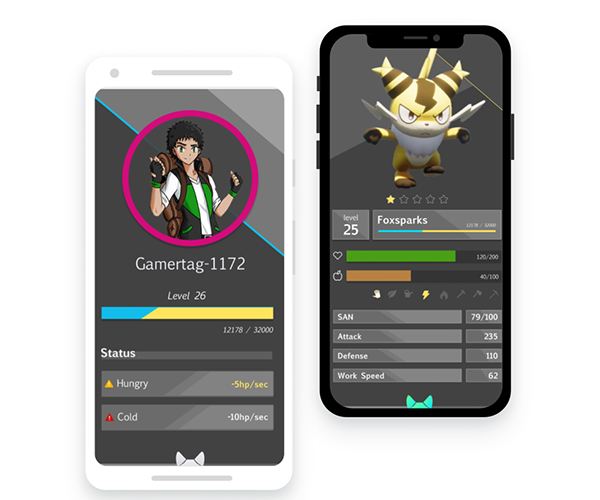
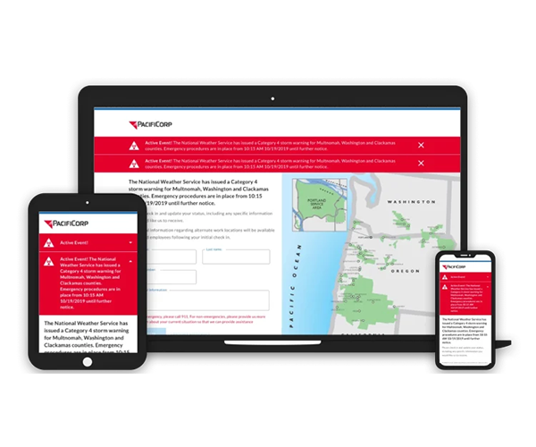
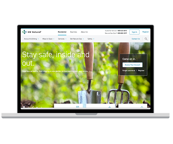
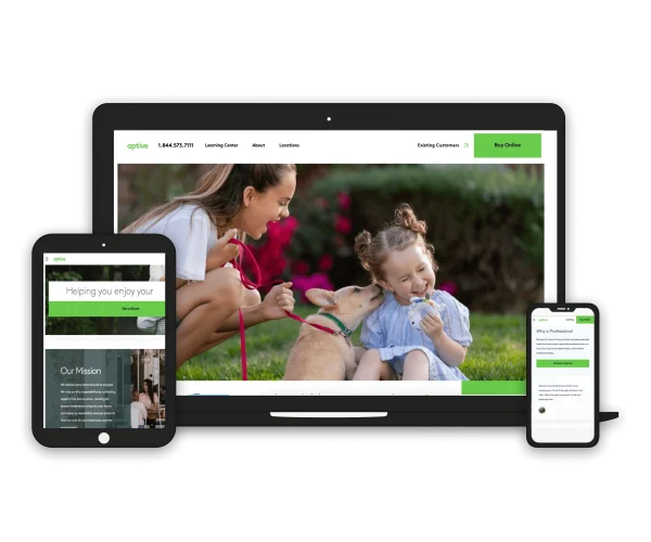
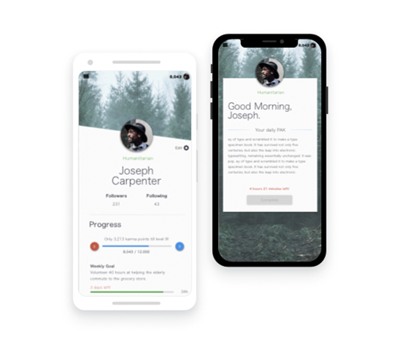
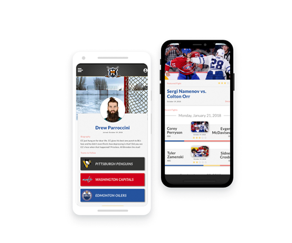
Choose Your President Based on Their Design Choices
The 2008 presidential election is fast approaching. If you are like me, you have realized that nearly every source of news that we come across is biased in one way or the other. This leaves us unable to form a valid opinion on our candidates without feeling a bit lost and confused as to weather we made a proper choice or not.
So this year instead of doing research of all the candidates, their issues, political stands and morality, I am going to pick my candidate based solely on the design of their website, logo and the technical knowledge put into their site.
Crazy you say? Un-American? You bet your ass it is.
I'm sick of the lies we hear on TV all day. The constant smear campaigns and shady backhanded comments that increase each week as we near V-day (Voting day - cool eh?). It's time to vote on their marketing instead of what they will actually do for our country. Right?
Since I work a normal job, I am only sticking to the top three candidates. Barack Obama, Hilary Clinton and John McCain. Is there anyone left besides them, seriously? If so, they better step up their marketing a bit. (I'm looking at you guys, call me if you need help.)
Logos & Branding
Well all of our candidates have solidified a logo to represent them in the times where words aren't welcome, or needed. Here are our candidates:
How cute, eh? Three logos all in a row. The only political correct thing would be to go down the line and talk about each one. You guys are lucky I still have some patience tonight.
Clinton logo
Ah, good ole Mrs. Clinton. I was a huge fan of Bill. That cool cat would open up a UN meeting with a sax solo and smoke a cigar while having an orgy on top of the national surplus. My kind of guy.
Out of the three, I hate Clinton's logo the worst. The font is Goudy Old Style Extra Bold, not a bad choice overall, but it is very close to Times New Roman which is tired and unimaginative in my opinion. The "new and edgy" version of the flag as an underline doesn't really make me smile or anything, and without it and the blue background, the text just sits there and doesn't say anything but "I just typed this on MS Word". When it comes down to it, this logo is just plain boring and stale, like most politicians.
Like I said at the beginning, I hate this logo more then the other two. So far missy, you aren't looking to good
Obama Logo
Barack Obama, a smooth talker who could afford to eat a steak or two has a really great logo if you ask me. The font is Joanna Standard at about 90% height I believe. I find it interesting that Obama strayed from the navy blue color with white text and instead used #082255 and #007DC3 for his text. Very original good sir.
The graphic that Barack used is very progressive to say the least. This logo hits home with the "web 2.0 crowd" and really shows a symbol of progression and change. The colors are bright and happy, and give a "brighter, better tomorrow" feeling with the circle in the middle.
Obamas logo can be used without the graphic and still give a unique feel to it. The colors really stand out against the white and can also be used with black text and still look unique. I approve.
McCain Logo
Before I start, let me say that I am a Democrat. If a republican wants to win my vote, he needs to show me some brilliant innovative design that makes me tremor in my chair and cry a tear of happiness. At least since the Bush administration put a bad taste in mine (and everyone else's) mouth. Well...
Although I will give him points for effort, I simply can not get into this logo. The font is Optima Black and while I have nothing but love for gradients, a solid gradient as your background is going to screw you up on the print side of things.
The little star inside the yellow is pretty neat, I will say, and can work well for a business card (do presidents have business cards?) or letterhead, I don't find it stunning or ground breaking. I also just learned that the star was a military symbol... Wow, what a great thing to include in your logo, an association with the military which then associated you with the war so in my mind McCain = War, sweet. Out of the three, I think McCain comes in second for logo design.
Conclusion:
Basically if I was up for it and went into a voting booth and saw these three logos, Obama would get my vote easily. Good job man, you earned it.
On another note, I was wondering what the backlash will be from this. Will I get a bunch of hate mail saying "If you know so much, make them a better logo, n00b!" Well, I'm not doing that. But if I was running for president, my logo would be something like this.
Oh yea, vote for me. Also, if you feel this is crazy, enraging or hilarious, let me know! email me at andrew@parroccini.com, if it's political talk, I'll be sure to ignore it or tell you you're an idiot. Cheers.
Coming Soon - Websites! Give me a day or so, I'm beat.
A New Site Has Arrived
After a year of version 3 being online, I decided it was time for a change. I figured this time I should go a bit wild and make version 4 with a bit more personality and energy. The result, as you can see, pleases me.
There are some new additions to this site, as well as some changes in the navigation. I have included a "freebies" section, where I will put some homegrown brushes, vectors and code snips for you, the designer, to use at will.
I have removed my seperate sections for graphic design and web design and combined the two into one big page. I will be setting this up by client as to include their graphics and web work all at once. I feel this change will give people a quick and easy way to see all of my work in one happy home, instead of jumping around.
Anyways, that's all for now. If you enjoy the site, please drop me a line and tell me about it. Without feedback and communication, we can go nowhere in thie world!
Cheers,
Andrew